
Martin Saar – an artist’s website built like a gallery
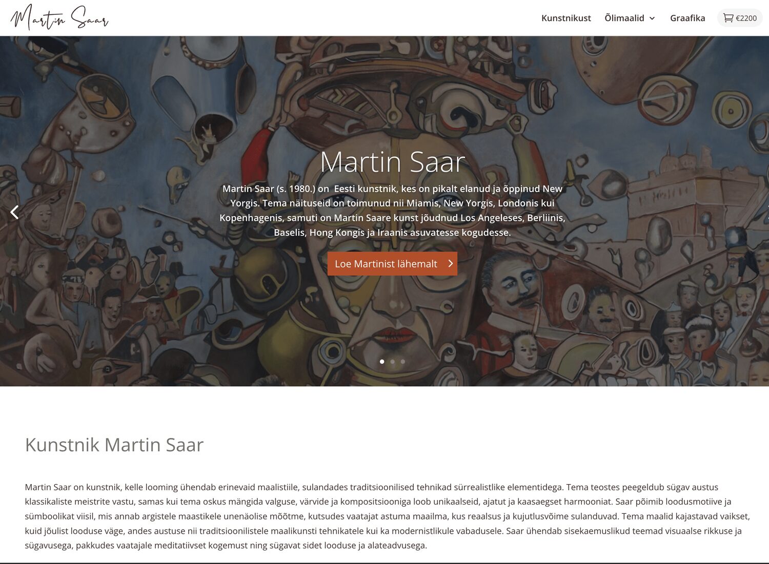
We built the website of international artist Martin Saar from scratch, and it reads first of all as a gallery – the work comes first and buying stays discreetly in the background. But the moment a visitor taps the cart icon, a smooth and complete store experience begins.
Project
Client: Martin Saar · Type: WooCommerce art store (Divi) · Market: Estonia / EUR · Collections: oil paintings and prints · Site: martinsaar.com
Challenge
An artist’s website is not an ordinary store
Martin Saar is an internationally recognised Estonian artist – he has exhibited in Miami, New York, London and Copenhagen, and his work has entered collections in Los Angeles, Berlin, Basel and Hong Kong. An ordinary online store does not suit work like that. Loud “BUY NOW” buttons and discount badges would cheapen the art.
At the same time the works genuinely are for sale, and not cheaply. What was needed was a site that gives every painting room to breathe, as it would have on a gallery wall, while still being a complete store where a collector can buy a piece there and then. Two goals that tend to kill each other: if the store is too pushy, the gallery disappears; if the gallery is too pure, nothing can be bought.
Solution
Gallery at the front, store quietly behind
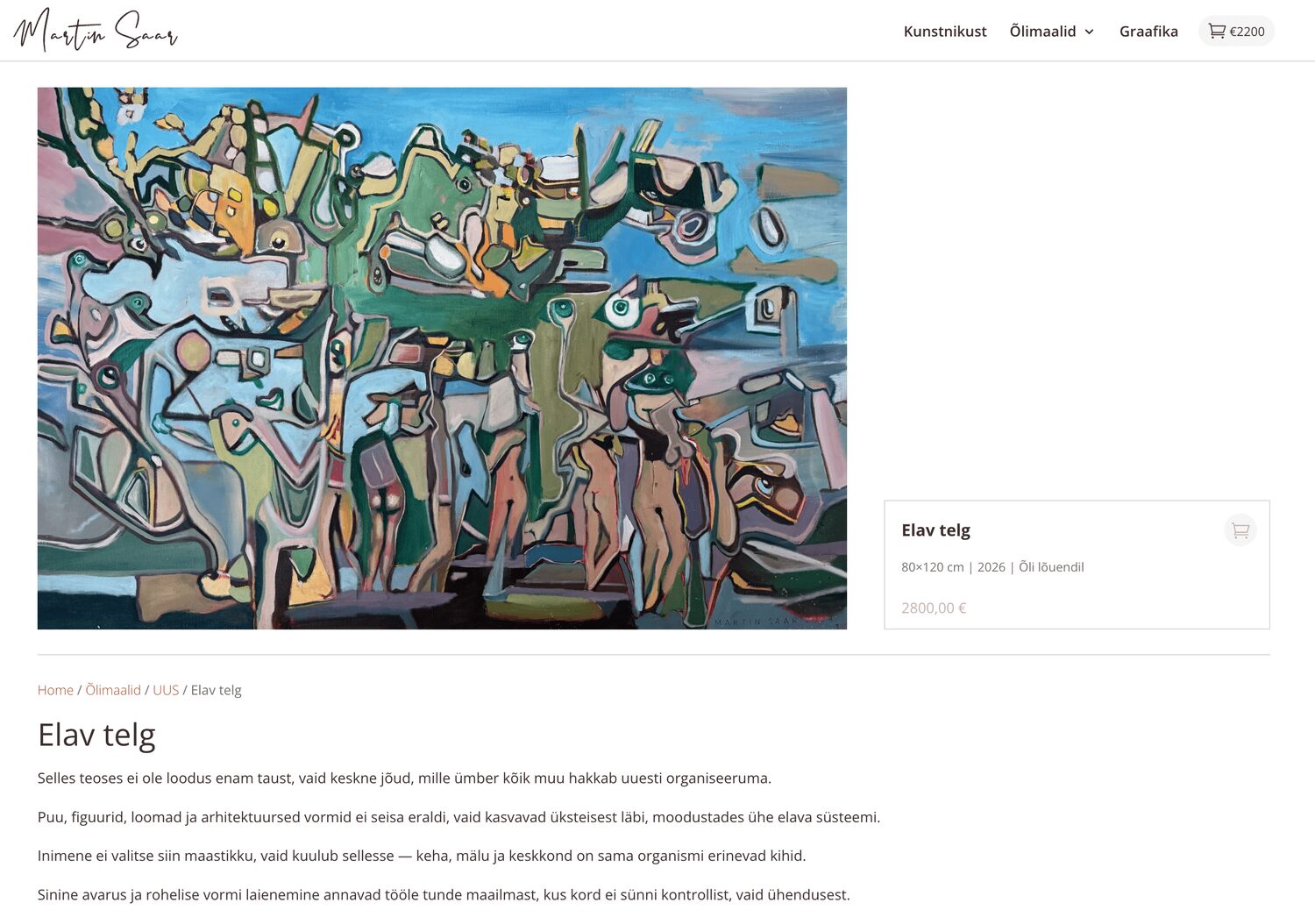
We built the site from scratch on Divi and gave the works first place. Every painting is presented large, on a clean background and at full resolution – exactly as it would hang on a gallery wall. The menu speaks the artist’s language too (About the artist, Oil paintings, Prints) rather than the store’s (“Shop”, “Sale”, “Cart”).
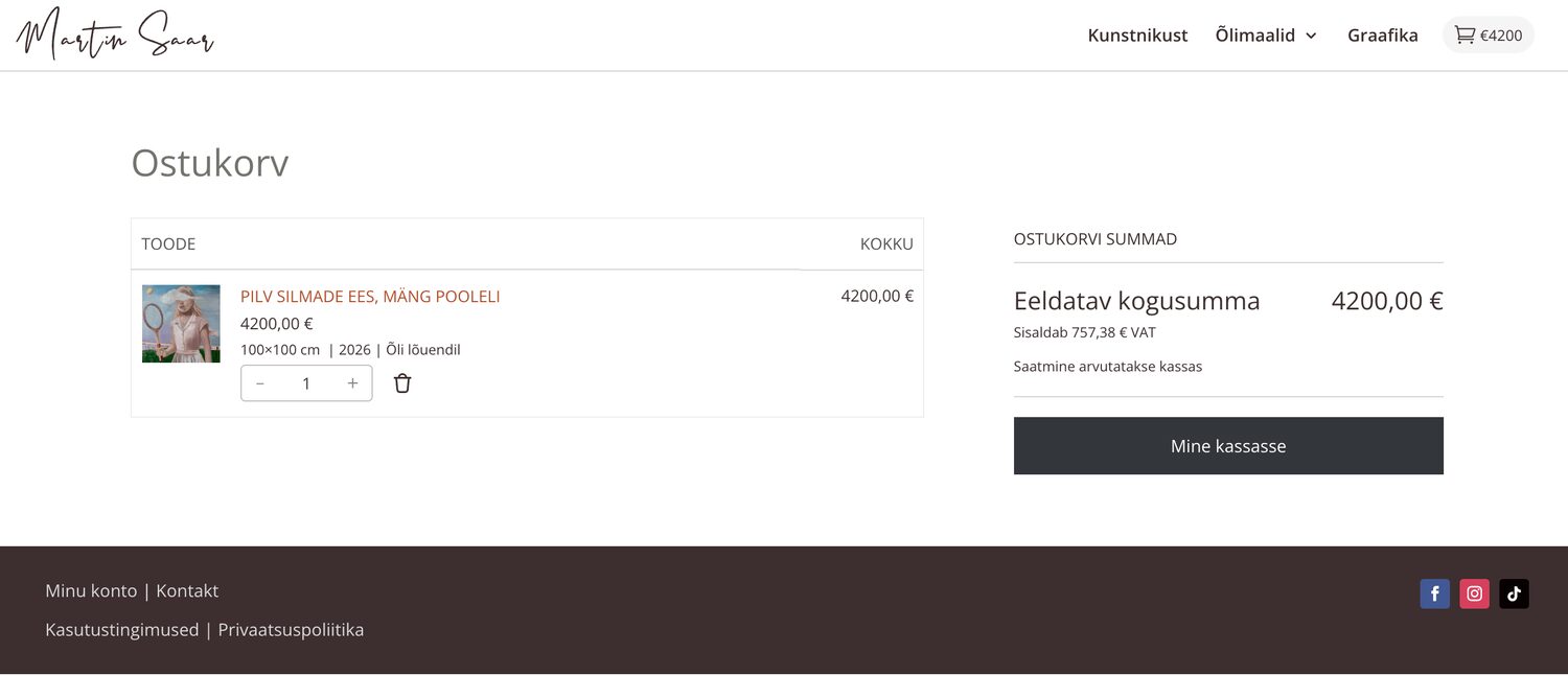
Buying is deliberately understated: there is just one discreet cart icon in the corner. It is always there, but it does not shout. As soon as a visitor taps it, a full WooCommerce buying experience comes forward – variations, stock, cart, checkout and payment. The store is there the whole time; it simply does not get in the way of looking at art.
Features
A gallery experience with store functionality
- Gallery view – works at full size on a clean background, with no distracting zoom widget
- Two collections – Oil paintings and Prints, presented in the artist’s own language
- A quiet cart – the store is there, but it does not dominate the gallery
- Variations and live stock – different formats and edition sizes are shown correctly straight away
- Montonio payments – card payment and bank link for Estonian customers
- Optimised images – full-resolution gallery images and correct square previews
And when a visitor is ready to buy, nothing trips them up: from cart to checkout everything is clear and conventional – exactly as in any good online store.
Under the hood
Divi and one thin custom layer
The site runs on Divi, with a thin custom child theme written on top – the only custom code on the whole site. That layer is what ties the gallery and the store together: it enforces full-size gallery images and correctly cropped previews, switches off Divi’s default zoom widget so the work looks clean, and gives the front page live information about the product and the stock of each variation, so buying is quick.
The cart, checkout and orders are handled by WooCommerce itself, and payments go through Montonio. The whole site is in Estonian and priced in EUR. Simple, maintainable and free of surplus plugins – exactly as much code as needed, and no more.
Result
A gallery that also knows how to sell
The result is a site that reads first as the exhibition of an internationally shown artist and only then as a store – but the store is there in full the moment a collector is ready to buy. A clean, calm and dignified presentation that lets the works do the selling themselves.
It is a good example of our approach: build exactly what the project needs – here the feeling of a gallery and the functionality of a store in one – without either swallowing the other.
Get started
Need a website that sells without shouting?
Tell us what you’re building – or let us take a look at the project you already have.

